The Tip That Changed My Photos
- Sep 7, 2023
- 3 min read
Updated: Sep 14, 2023

A travel blog wouldn’t be very good if it didn’t have pictures, and even though I’ve moved beyond just writing about travel, I still know that a beautiful picture will draw in readers. My mother always enjoyed photography and as we drove around to different parts of the state during my youth, she’d tell my dad to pull over so she could take a picture. She wasn’t an expert at the craft, but those memories encouraged me to pick up my own camera at an early age.
I won’t pretend to be an expert at photography either. It wasn’t until I got back from Ireland that I actually thought to look up how to take good photos. I stumbled across this blog post, which really helped, and introduced me to the photography tip that transformed my pictures. That tip is the rule of thirds.
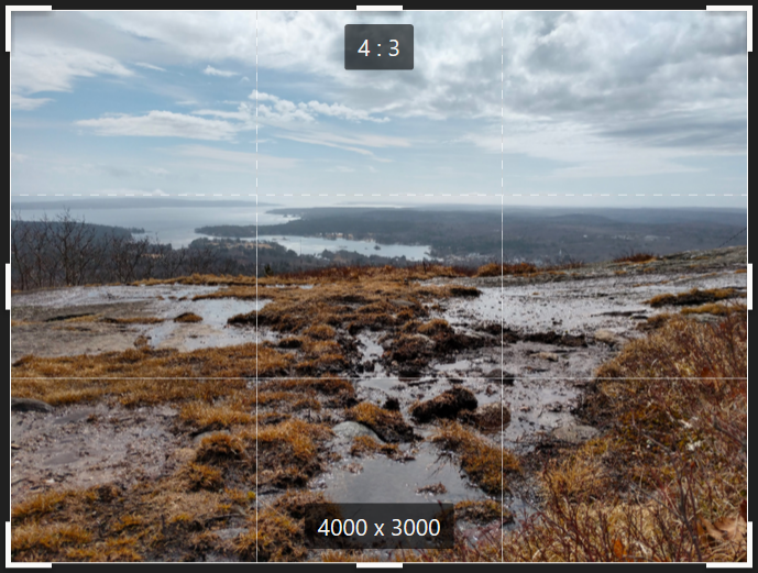
The rule of thirds is simple. You lay a 3x3 grid over your picture. Most editing software will automatically enable the grid when you go to crop the photo. Some cameras will enable it before you even take the shot. I crop my pictures right in the Microsoft Photos App, so all my examples will be from that.

Let’s look at the picture that drew you into this post. This is a picture I took on Blue Hill. Right behind me is the ice patch that I kept falling on, which you can read all about in last week’s post. Applying the rule of thirds helps direct focus when viewing the picture. With this landscape, it’s easy enough to divide the picture into the foreground (mud pool), midground (distant ground and coast), and background (sky). This allows for equal attention to the multiple dimensions present in the picture, which more importantly, reduces distraction from the focal point: the water runoff. This introduces another tip called leading lines (basically, the human eye naturally follows lines), but notice how this line of water runoff is centered in the picture, naturally directing the eye from the foreground all the way to the background in equal measure.
Let’s look at a picture with a subject! This is a cow I hung out with, while at a retreat. I don’t know much about them, but they're very charming and very photogenic. Even with a vertical picture, the rule of thirds can still be applied. Just like the Blue Hill picture, my subject is centered. I took this picture through a fence, and did my best to frame the cow with the wooden boards. Having the boards in the bottom and top thirds helped create a balance, so neither distracted too much from the cow or the lovely rolling hills in the background.


Here’s one more picture. This one is from my first post in The Places Between series, and features a crab shell at Cutler Coast Public Reserved Land. Notice how the crab shell isn’t centered in this picture. Instead, I placed it at an intersection point. If you tilt your head to the left, you can see that the foreground, midground, and background of this photo moves in a diagonal. By putting the shell on the intersection point, I can still direct focus to it without taking away from the picture's dimensionality.


Writing is a profession for me and a lot of stress can come from that, but photography is a hobby. I won’t pretend to be anything more than an amateur, and I have no ambitions of becoming a professional, but learning the rule of thirds has made me enjoy photography even more. I’ve become more confident in experimenting with framing, composition, and different points of focus. I get curious about what something might look like at a different angle, and I get cozy on the ground or between the branches of a tree. There’s a certain mindfulness that I inhabit when taking a picture. It’s just me and the wonder of the subject that leads me to raise the camera and click.


Comments